Changelog
Changes to the book's content
- : uploaded to site
Introduction
The OpenType format (OTF, file extension .otf) is a popular modern font format that supports advanced features like ligatures, fractions, and small-caps, and allows you to apply these features manually or according to the script and language of the text.
These features are encoded in OpenType code, a simple language that describes the how a text engine should swap or change glyphs when someone writes text. For example, this OpenType code swaps (substitutes, sub) lower-case letters for (by) small-caps:
sub a by a.sc;
sub b by b.sc;
sub c by c.sc;
This tells your computer's text engine that when you type a lower-case “a”, it should instead draw the letter's small-caps form (marked with .sc). The underlying text doesn't change, just the way it's drawn on-screen. If you copied the small-caps text and pasted it in plaintext, it'd return to ordinary lower-case.
There are other rules, such as many-to-one substitution, contextual substitution, and ligatures, but the code for each kind is very similar and based on the foundation written above.
OpenType code is simple and many OpenType features are straightforward, but a few are surprisingly hard to write code for. The first problem is that there are few public examples of OpenType code outside of git repositories for open-source fonts. The OpenType Cookbook can help with that.
The second problem is that some features are partly open-ended—neither very strict nor very free. A feature like small-caps (smcp) is very strict—you just replace lower-case letters (and optionally virtually all characters in the font) with small-caps forms. A feature like ligatures (liga) is very free—you just add whichever ligatures you think will work well in your font. A feature like case-sensitive forms (case) is somewhere in the middle—you have freedom over what it applies to, but it definitely can't apply to anything and everything.
This book is a set of tips for different OpenType features that fall in this awkward middle-ground, as well as support for uncommon localisations. It's written for font designers. It's a perpetual work-in-progress—each section is more-or-less done, but new sections may be added in future.
Tabular Figures (tnum)
Figures (meaning numerals) are often spaced and kerned with each other for a smoother appearance, but in some situations they look far better all using an equal (fixed) width, e.g. all 600 units wide. One obvious case is in data tables (which is why this feature's called “tabular”), and another is in timestamps. Enter “tabular figures”, code tnum, which swaps numerals and some related characters for fixed-width versions.
Most of these characters just need to have their side-bearings changed so they're all the same width. A few can benefit from a redesign to make the character take up more horizontal space: adding serifs to (or changing serifs on) the numeral 1, drawing parentheses with a stronger curve, etc.
Characters
- numerals
- hyphen-minus
- maths symbols
- numerical separators (period, comma, figure dash etc.)
- parentheses, brackets, and braces
- currency symbols
- en dash (for numerical ranges)
- underscore
- figure space
Notes
- Numerical separators
-
Separators include the baseline (
.) and centered (·) periods, comma (,), colon (:), semicolon (;), figure dash (‒), and possibly others. They separate numbers or parts of numbers, e.g. the period and comma are used in decimal numbers in various languages, the colon is used in ratios and times, and so on.
Case-Sensitive Forms (case)
Many punctuation marks and symbols are drawn and aligned to blend with lowercase characters, so they don't quite match with all-caps text. Enter “case-sensitive forms”, code case, which swaps these glyphs for ones drawn taller or shifted upwards, making for a more balanced look.
Exactly where case-sensitive forms should be vertically aligned to is up to you. It depends on the exact design of your font. However, in more conventional designs they can normally be centred on the middle crossbar of capital “E” or just halfway from baseline to cap height.
Characters
- numerals
- maths symbols
- parentheses, brackets, and braces
- colon and semicolon
- hyphens and dashes
- at sign
- inverted question and exclamation marks
- guillemets
The following characters are less-typical to include in case-sensitive forms, but could still be added to the feature:
- bullet
- centred period
- slash and backslash
- ASCII tilde and circumflex
Notes
- Numerals and maths symbols
-
If your font includes oldstyle numerals (numerals with varying height and vertical alignment), then swap them for lining numerals in the
casefeature. Do this no matter whether oldstyle or lining is the default; even if lining is the default, someone might apply oldstyle to their entire text, and any text they write in all-caps will still need lining numerals.Mathematical operators (plus, minus, etc.) and other numeric symbols (number sign/hash, percent, etc.) should also be swapped for lining numeral versions if you have both oldstyle and lining ones, though alternatively they could be vertically aligned for capitals instead.
- Parentheses (
()), brackets ([]), braces ({}) -
Normally these are drawn from a font's descenders up to its ascenders or capital height. Capital glyphs rarely descend (one exception being marks and diacritics below the baseline), so the case-sensitive forms of these characters should be drawn higher and/or taller.
- At sign (
@) -
This character is normally vertically aligned so the lower-case “a” at the centre is in the same position as a regular lower-case “a”, but its case-sensitive version should be brought upward so it occupies the same vertical space as capitals.
You should rarely need it, as it's mainly used in email addresses (which are conventionally written in lower-case), but add it just in case.
- Inverted question and exclamation marks (
¿¡) -
These are normally vertically aligned for lowercase letters. Raise them so they occupy the same vertical space to their non-inverted forms.
Ordinals (ordn)
Ordinal numbers are numbers indicating a thing in a series of things, e.g. “first”, “second”, “third”. They're often abbreviated by combining the number with the last one or few letters from the word, e.g. “1st”, “2nd”, “3rd”. Those letters are called the “ordinal indicator” (e.g. “st” in “1st”).
Historically, in several West-European languages, ordinal indicators were written in superscript. This can be implemented using the “ordinals” Opentype feature, code ordn. However, superscript ordinal indicators fell out of fashion with the rise of digital text, and many style guides and official sources advise using ordinary letters instead of superscript ones. Think of OpenType ordinals as a semi-historic feature—maybe nice to have, but not very useful outside of fonts with an archaic style (e.g. old handwriting).
Examples
These examples cover all variations used in Latin-script languages that I could confirm used superscript characters in ordinal abbreviations:
- English modern
- 1st, 2nd, 3rd, 4th
- English archaic
- 2d, 3d
- Irish
- 1ú
- French
- 1er, 1ers, 1re, 1res, 2e, 2es, 2d, 2ds, 2de, 2des
- Spanish/Portuguese
- 1o, 1os, 1a, 1as, 1.o, 1.os, 1.a, 1.as
- Spanish extra
- 1er, 1ers, 1.er, 1.ers, 3er, 3ers, 3.er, 3.ers
- Asturian
- 1u, 1us, 1a, 1as, 1o, 1os
French has other, on-standard indicators as well: ere/ère/eres/ères for the first ordinal; nd/nds and nde/ndes for the second ordinal; and ème/èmes or even ième/ièmes for any ordinal. I have no idea if, and if so how often, these are or were used in superscript forms—everywhere I've seen them, they've been ordinary glyphs—so I've left them out of this list. They're also pretty long, which makes their superscript forms look awkward in ordinary text (to me, anyway).
Spanish and Portuguese share generic indicators, but Spanish also includes extra indicators for ordinals of “1” and “3”. That said, it's not clear to me whether this is actually unique to Spanish or if it's a case of being common in one language and rare in another.
Spanish even supposedly has further variants, e.g. “ro”, “do”, and “ra”, but I haven't seen actual examples of them in use outside of graphic design work like posters for events, which may not be indicative of their use in ordinary text. Again, I've left these unusual variants out of the list.
Characters
Add superscript versions of these characters to cover the above languages:
- a
- d
- e
- h
- n
- o
- r
- s
- t
- u
- u-acute (ú,
U+00FA)
OpenType code
The following code uses contextual substitution to replace any series of indicator letters following a numeral (optionally with a period between them) with ordinal superscript forms. This has the advantage that you can apply the ordn feature to an entire block of text instead of having to apply it specifically to each ordinal.
@figures = [ zero one two three four five six seven eight nine ];
@indicators = [ a d e h n o r s t u uacute ];
@indicatorsSuper = [ a.ordn d.ordn e.ordn h.ordn n.ordn o.ordn r.ordn s.ordn t.ordn u.ordn uacute.ordn ];
sub @figures @indicators' by @indicatorsSuper;
sub @figures period @indicators' by @indicatorsSuper;
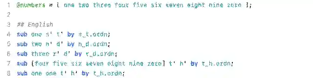
sub @indicatorsSuper @indicators' by @indicatorsSuper;The following code can be added to the previous code if you want ligatures for the multi-letter indicators listed above, e.g. for cursive fonts:
# ligatures
## English
sub s.ordn t.ordn by s_t.ordn;
sub n.ordn d.ordn by n_d.ordn;
sub r.ordn d.ordn by r_d.ordn;
sub t.ordn h.ordn by t_h.ordn;

## French
sub e.ordn r.ordn s.ordn by e_r_s.ordn;
sub e.ordn r.ordn by e_r.ordn;
sub r.ordn e.ordn s.ordn by r_e_s.ordn;
sub r.ordn e.ordn by r_e.ordn;
sub d.ordn e.ordn s.ordn by d_e_s.ordn; # variant second
sub d.ordn e.ordn by d_e.ordn; # variant second
sub d.ordn s.ordn by d_s.ordn; # variant second
sub e.ordn s.ordn by e_s.ordn;

## Iberian
sub a.ordn s.ordn by a_s.ordn;
sub o.ordn s.ordn by o_s.ordn;
sub u.ordn s.ordn by u_s.ordn;
This set is not exhaustive and I'm also going based off individual reports about rarer forms from people who write in these languages. The exact division of the Iberian ordinals in particular are kinda unclear to me, so I haven't divided the ligatures using OpenType languages; you can type any ordinal indicator in any language.
British Orthography
The British Isles are home to over a dozen minority languages based on the Latin script. To fully support their orthographies, you need a range of diacritics, one modification, and one new character. However, a font that supports common Western European languages like French, Spanish, and German is well on the way to supporting the full British orthography too.
Characters
These character sets are written a certain way: letters with marks, which means that all of the letters (in upper- and lower-case) need to be paired with all of the marks.
There's a lot of overlap, so check the Total entry at the bottom for a list of the unique characters.
- Welsh
-
a e i o u w ywithacute circumflex dieresis grave - Scottish Gaelic
-
a e i o uwithgravea e owithacute - Irish
-
a e i o uwithacuteb c d f g m p s twithdot
additional character: lower-case Tironian et (⁊,U+204A)
additional character: upper-case Tironian et (⹒,U+2E52, rare) - Manx
-
cwithcedilla - Cornish
-
a e o uwithcircumflex graveiwithcircumflexe ywithdieresis - Total
-
a e i o u w ywithacute circumflex dieresis gravecwithcedillab c d f g m p s twithdot
additional character: lower-case Tironian et (⁊,U+204A)
additional character: upper-case Tironian et (⹒,U+2E52, rare)
Notes
This doesn't include the cants, Traveller and Romani languages, Scots or Ulster Scots, or the Channel Islands languages. Those languages either don't have consistent (or any) written forms, or don't use characters beyond the English Latin alphabet.
Gaelic Type
Gaelic type (a.k.a. Gaelic script) was a form of Irish lettering used by printing presses from the 1500s to the 1900s, at first and in part as a means of English soft power and later by Irish nationalists to distinguish themselves from their English oppressors.
It's mainly characterised by “insular” versions of numerous Latin letters, as well as other modifications and one new character (in upper- and lower-case forms), and exists in both type (mechanical) and script (hand-written) forms. While relatively rare in the present, it's still used in some ceremonial, official, or decorative text.
Modifications
- Insular letters
-
Gaelic type uses several “insular” versions of Latin letters:
- insular D/d (
U+A779/U+A77A) - insular F/f (
U+A77B/U+A77C) - insular G/g (
U+A77D/U+1D79) - insular r (
U+A783) - insular s (
U+A785) - insular T/t (
U+A786/U+A787)
Virtually all Gaelic fonts use the insular “D”, “F”, “G”, and “T” (in upper- and lower-case). Some also use the lower-case insular “r” and “s” listed above; whether you use these two is up to you. They seem to only rarely use upper-case insular “R” and “S”.
The unicode characters should not be used in ordinary text. They were only added to unicode for linguists and historians and don't decompose well the same way accented letters can decompose to letter and mark (see the bottom of page 3 in the proposal to add insular letters to unicode).
Instead, use OpenType substitutions to replace the Latin glyphs with insular glyphs of the same characters. See more info in the OpenType code below. You can still include the insular letters as standalone unicode glyphs, but it should be possible to display Gaelic type without them (at least until people improve the technology in this area).
- insular D/d (
- Accented letters
-
Various letters have accented forms with the acute or dot accents. See the Irish section of the British Isles orthography for full lists of accented characters in Irish. Insular letters should also have accented forms.
- Dotless i
-
The lowercase i shouldn't have a dot. This is a stylistic change—do not use the dotless-i unicode character, “ı”, which is a separate letter used in several Southeastern European languages. Just use OpenType substitution to replace the ordinary lower-case i with a dotless form.
- Tironian et
-
The Tironian et is basically the Gaelic type version of the ampersand, originally derived from Roman shorthand by the scribe Tiro. It exists in both lower-case (⁊,
U+204A) and upper-case (⹒,U+2E52) forms, though it's extremely rare to see the upper-case form in fonts (it's often just a raised or taller version of the lower-case form).It's extremely rare to find both the ampersand and the Tironian et in the same text. Use an OpenType substitution to replace the Latin ampersand with an alternate ampersand that looks like the et (e.g.
sub ampersand by ampersand.ssXXorsub ampersand by ampersand.insular). You can still include the Tironian et as a pair of standalone unicode glyphs, but it should be possible to display Gaelic type without them (at least until people improve the technology in this area).
Several other letters not specified above are often drawn in alternate forms for Gaelic type. The letter “A” (upper- and lower-case) often has a unique shape with a very low and bowing crossbar, and various other upper-case letters (B, E, H, L, M, N, P, U) may be drawn as capital-sized versions of their lower-case forms. However, these are stylistic choices for individual Gaelic fonts. You don't need to implement any of them if you're just extending a more general font to support Gaelic type.
OpenType code
OpenType has no Gaelic type feature. However, you can implement it in a stylistic set with the following code (modify the suffix to match the stylistic set number):
# insular upper
sub D by D.ssXX;
sub F by F.ssXX;
sub G by G.ssXX;
sub T by T.ssXX;

# insular lower
sub d by d.ssXX;
sub f by f.ssXX;
sub g by g.ssXX;
sub r by r.ssXX;
sub s by s.ssXX;
sub t by t.ssXX;

# insular upper dot-accent
sub Ddotaccent by Ddotaccent.ssXX;
sub Fdotaccent by Fdotaccent.ssXX;
sub Gdotaccent by Gdotaccent.ssXX;
sub Tdotaccent by Tdotaccent.ssXX;

# insular lower dotaccent
sub ddotaccent by ddotaccent.ssXX;
sub fdotaccent by fdotaccent.ssXX;
sub gdotaccent by gdotaccent.ssXX;
sub sdotaccent by sdotaccent.ssXX;
sub tdotaccent by tdotaccent.ssXX;

# other
sub i by i.ssXX; # i.ssXX is a copy of dotless i
sub ampersand by ampersand.ssXX; # copy of Tironian et